CONTRAST
Anti-design for a tattoo cosmetics company
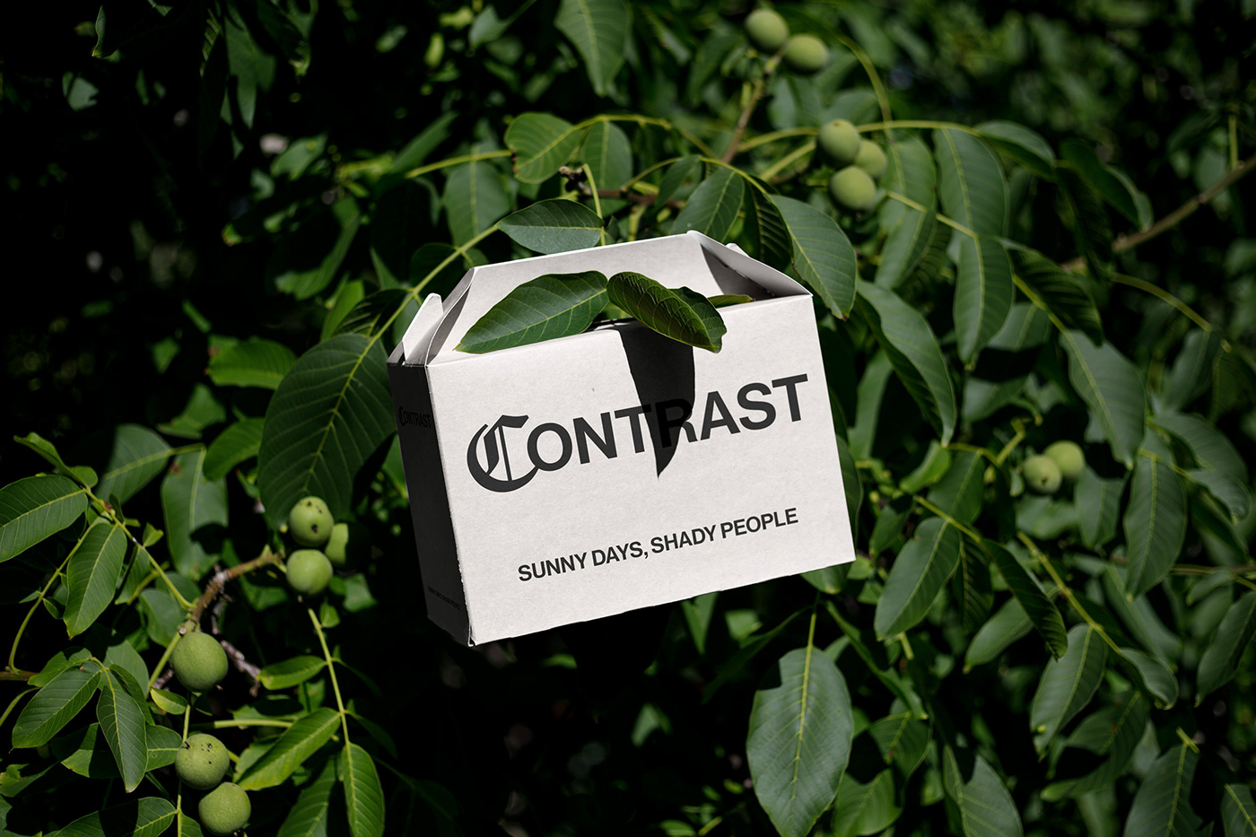
Contrast embodies the notion of standing out distinctly from its surroundings. In our approach to packaging design for the tattoo care cosmetics line, we strategically employ the concept of anti-design, which emphasizes standing out amidst the clutter of the marketplace. Through a deliberate play of light and shadow, we create a design that commands attention while maintaining an air of minimalism. By leveraging the power of contrast, we ensure that the product not only catches the eye on the shelf but also communicates a sleek and contemporary aesthetic, distinguishing it from competitors in the market.
Identity design, Packaging design, Graphic design, Art direction, Creative direction